Best Cabinet Designs for Huntington Beach Homes
There is no best door style in the abstract. There are styles that suit a low ceilinged ranch and styles that fight it, colors that hold their nerve in a room full of bounced light off the water and colors that go strange in it. This is a look at which directions tend to work in the houses this city is actually made of, and why.
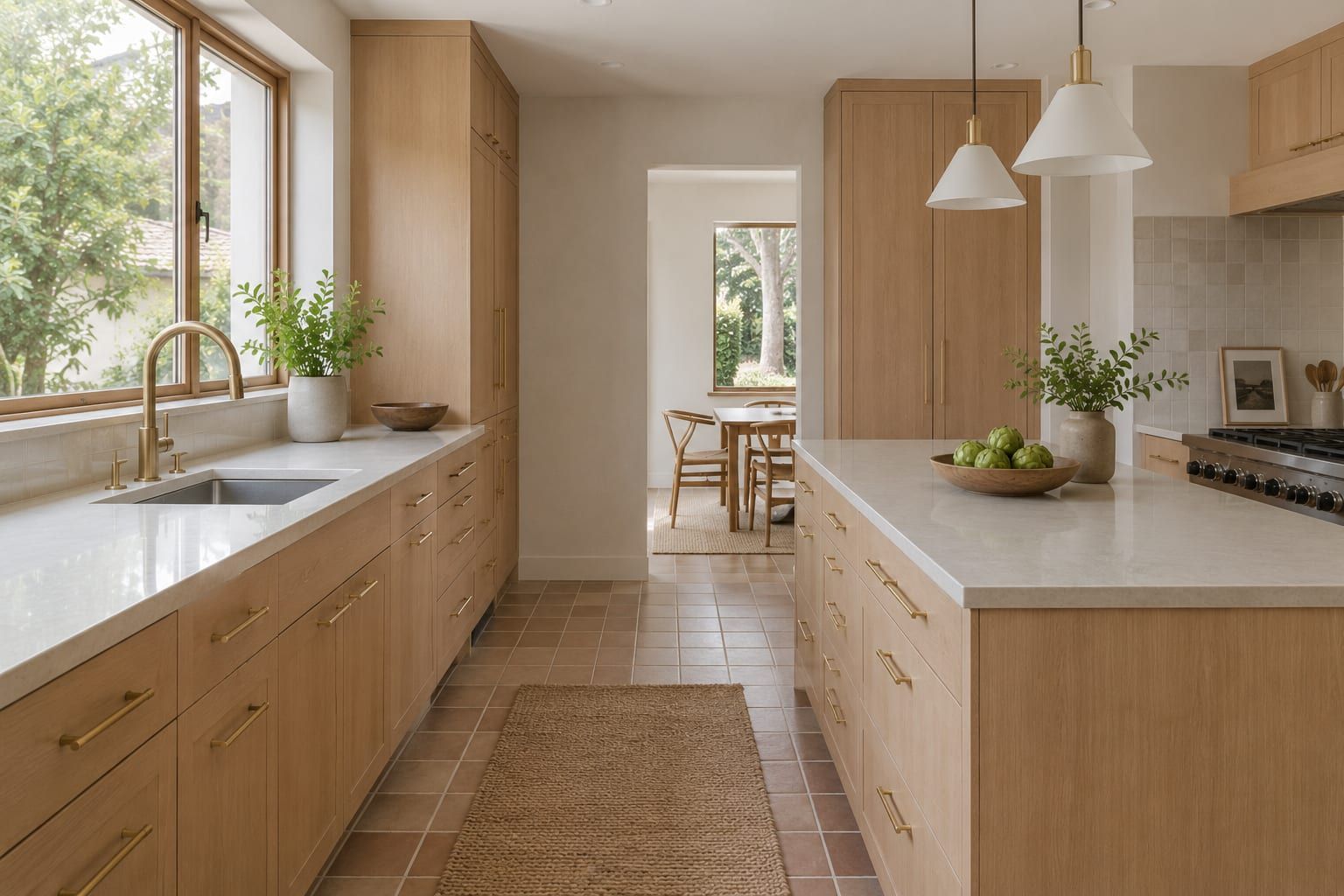
What are we designing for?
Three shapes come up over and over here, and they want different things.
The first is the long single story plan: low roofline, wide frontage, rooms laid out in a line, and a kitchen originally drawn as a service room rather than a place anyone would sit. Horizontal is the natural language of that house.
The second is the two story house on a smaller lot, where the kitchen sits under an eight foot ceiling but the living space next to it opens upward. Cabinetry there has to hold its own against a room with more air in it.
The third is the tall narrow build nearer the water, stacked over a small footprint, with the main living floor lifted for the view. Everything in that house is a little short of wall and a little short of depth.
Almost every good decision below comes from matching a design move to one of those three rather than to a photograph of somebody else's kitchen.
Flat slab or shaker in a mid century ranch?
This is the choice people agonize over, and in a low single story house the answer leans one way more often than the internet suggests.
A flat front has no frame and no molding, so nothing interrupts the surface. In a room with a low ceiling that reads as calm rather than plain, and it lets a long run behave like one continuous plane instead of a row of separate objects. Grain runs uninterrupted across the fronts if you want it to, which is a quiet way to make a wall look wider than it is. It also suits the architecture, since the houses themselves were drawn with straight lines and very little ornament.
A framed front, the style most people call shaker, adds a shadow line around every opening. Twenty of those in one room create rhythm and texture, which is exactly what a large or tall room wants and exactly what a small low one does not always need. Shaker also handles paint beautifully and reads as familiar rather than fashionable, which matters if you plan to sell inside a few years.
A useful middle route is mixing them by height. Flat fronts on the base run, where the surface is broad and mostly seen at an angle, with framed fronts above where the eye rests. Or the reverse in a room with a tall wall to fill. Neither is a compromise. Both are things you can only do when the fronts are made for your room, and the custom kitchen cabinets page covers how that gets drawn.
One practical note, unrelated to taste. A flat front shows a bowed wall more than a framed one does, because a shadow line forgives a little movement and a continuous plane does not. On a wall you already know is wavy, that is worth raising early.
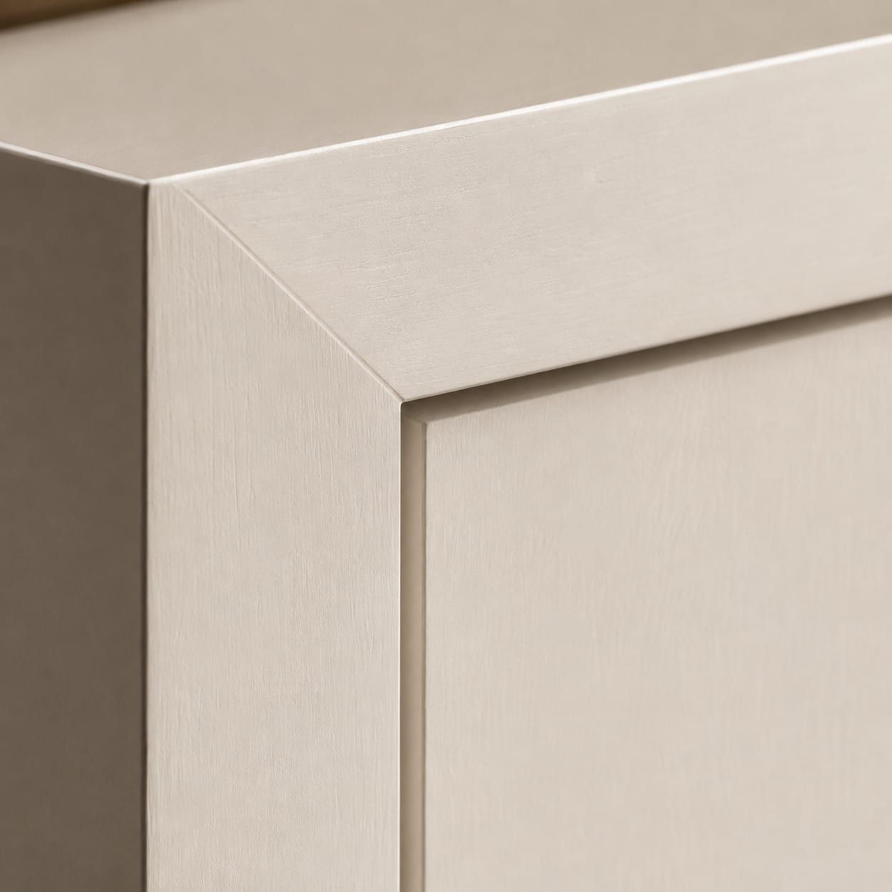
Why a full height storage wall works so well here
Take one wall of a room and make it entirely cabinetry, floor to ceiling, in a single finish, with the appliances built into it and nothing hanging on the walls elsewhere. It is the strongest single design move available in most local plans, and it is not really about capacity.
It is about the number of visual events in the room. A conventional kitchen scatters cabinetry around three walls at two different heights, with gaps, a hood, a window and a stretch of backsplash between the pieces. A storage wall gathers all of that into one flat plane and hands the rest of the room back as open surface. Rooms feel bigger when there is less to look at, not when there is less in them.
It suits the long low plan in particular, because the wall reads as architecture rather than furniture and does not crowd a ceiling that is already close. In a two story house it does something different and just as useful: it gives the kitchen enough visual weight to sit beside a taller living space without disappearing.
Two details make or break it. The run has to reach the ceiling with a proper closing detail at the top, since a tall wall that stops a few inches short undoes the whole effect. And the openings have to be planned, so the refrigerator and the tall oven sit inside the plane rather than breaking out of it. Rooms built this way in Costa Mesa ranches, where the cooking space and the living space frequently share one opening already, are where the effect shows up most plainly.
How should coastal light change your color?
Light near the water is bright, cool and very reflective, and it moves a long way across a day. That does specific things to cabinet color, and they are worth knowing before a sample is chosen in a showroom lit by something else entirely.
Cool whites go further than you expect. A white with a blue or gray bias, which looks crisp under warm shop lighting, can read as cold and faintly clinical in a room bouncing sea light off a pale floor. Warmer whites and soft off whites usually hold up better in the same room, and they carry morning and afternoon light very differently, which is a good thing rather than an inconsistency.
Mid tone natural wood is the safest strong choice here, and it is popular for a reason. A light to medium timber gives the eye something to hold in a room that is otherwise very bright, without absorbing the light the way a dark stain does. Pairing it with paint, one material below and the other above, or a wood island in a painted room, gives contrast without committing the whole space to a color.
Two rules of thumb. Take every sample home and look at it in the actual room at three different times of day, because a coastal room at nine in the morning and the same room at five in the afternoon are not the same room. And keep an eye on how much of the run stands in direct sun, since a wall of glass changes what a finish will look like in five years as well as today. That side of it is covered in detail on the coastal materials post.
What should the garage and the entry do?
In a beach household these two spaces carry a load nobody designs for, and they are where an otherwise tidy house falls apart.
The entry from the garage into the house is the real front door for most families, and it is the point where sand, wet towels, sports gear and school bags all arrive at once. A short bench with closed storage under it and a column of tall lockers beside it solves more daily annoyance per dollar than almost anything inside the kitchen. Make it closed rather than open. Hooks on a wall look great empty and look like a laundry pile in use.
In the garage itself, the design question is where the wet things live. Boards, suits and towels come home soaked and want moving air around them rather than a shut door, so give them a ventilated corner of their own and let the enclosed run hold everything else. Our garage cabinets page covers how a run gets built for an unconditioned bay, including why it hangs clear of the slab.
One design point ties the two together. If the garage run and the entry bench are drawn in the same finish family as the house, the transition stops feeling like a back door and starts feeling like a room. That costs very little at the drawing stage and nothing at all afterwards.
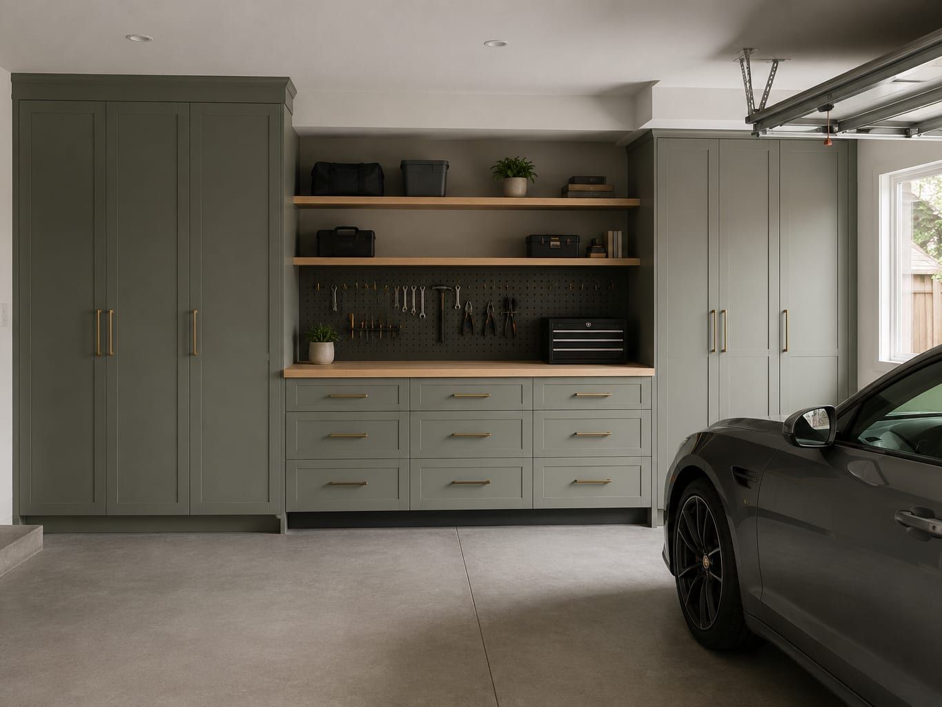
Two smaller moves that punch above their weight
Change the depth rather than the layout. In the tall narrow houses near the water, and in any long room where the walkway is tight, a run built shallower than standard hands back inches exactly where they are felt. It is invisible in photographs and obvious in daily use. Homes on the narrow lots along the strip get drawn this way often.
Decide where the line of your handles sits. Hardware is the one element repeated dozens of times in a room, so its placement is a design decision rather than an afterthought. Long pulls set in a consistent line across a base run reinforce the horizontal of a ranch plan. Small knobs break that line into pieces. Handleless fronts remove it entirely and make the plane the only thing you see, which is a strong look and asks for very even gaps to pull off.
Putting a direction together
Pick the house type first, then the plane, then the color, then the hardware. A low single story plan usually wants flat or lightly framed fronts, one uninterrupted storage wall, a warm rather than cool light color, and horizontal pulls. A two story house can carry more texture and more contrast. A tall narrow house near the water wants shallower runs, fewer materials and every inch of height used.
None of that is a rule you have to follow. It is a starting point that keeps a room from becoming a collection of separately good decisions that do not agree with each other. If you would rather look than read, finished rooms are grouped by type in the gallery.
And if you would like a direction drawn against your own floor plan, send it over and we will sketch one against it. There is no charge for that conversation, every set of custom cabinets this shop makes starts with it, and elevations carrying true measurements arrive long before anybody asks you to commit.
Design your cabinets with us, free of charge
Free in-home consultation and a written quote.